Check in Be out
/21-22

UX
UX Writing
User Research
UI
Design System
Client
Deutsche Bahn AG
Credits
Mobimeo GmbH
When
/21-22
What
Mobile App
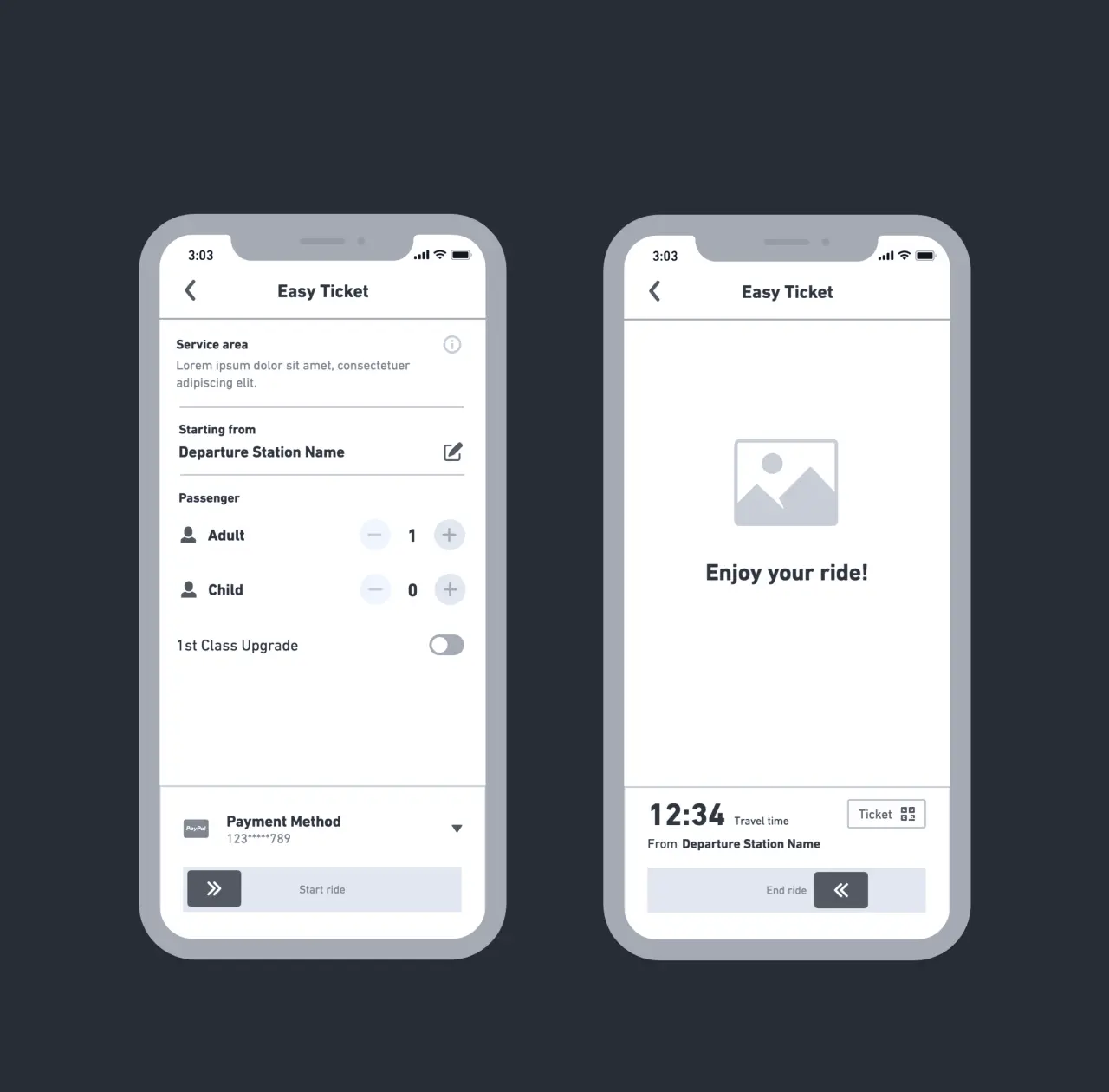
Local public transportation plays a vital role in achieving climate goals and making urban environments more livable. Nevertheless, even buying a ticket is a major hurdle for many people - too many transport associations and tariff systems often make convenient travelling impossible. What if all it took was a swipe to travel as long and far as you wanted? Check in Be out makes that possible.
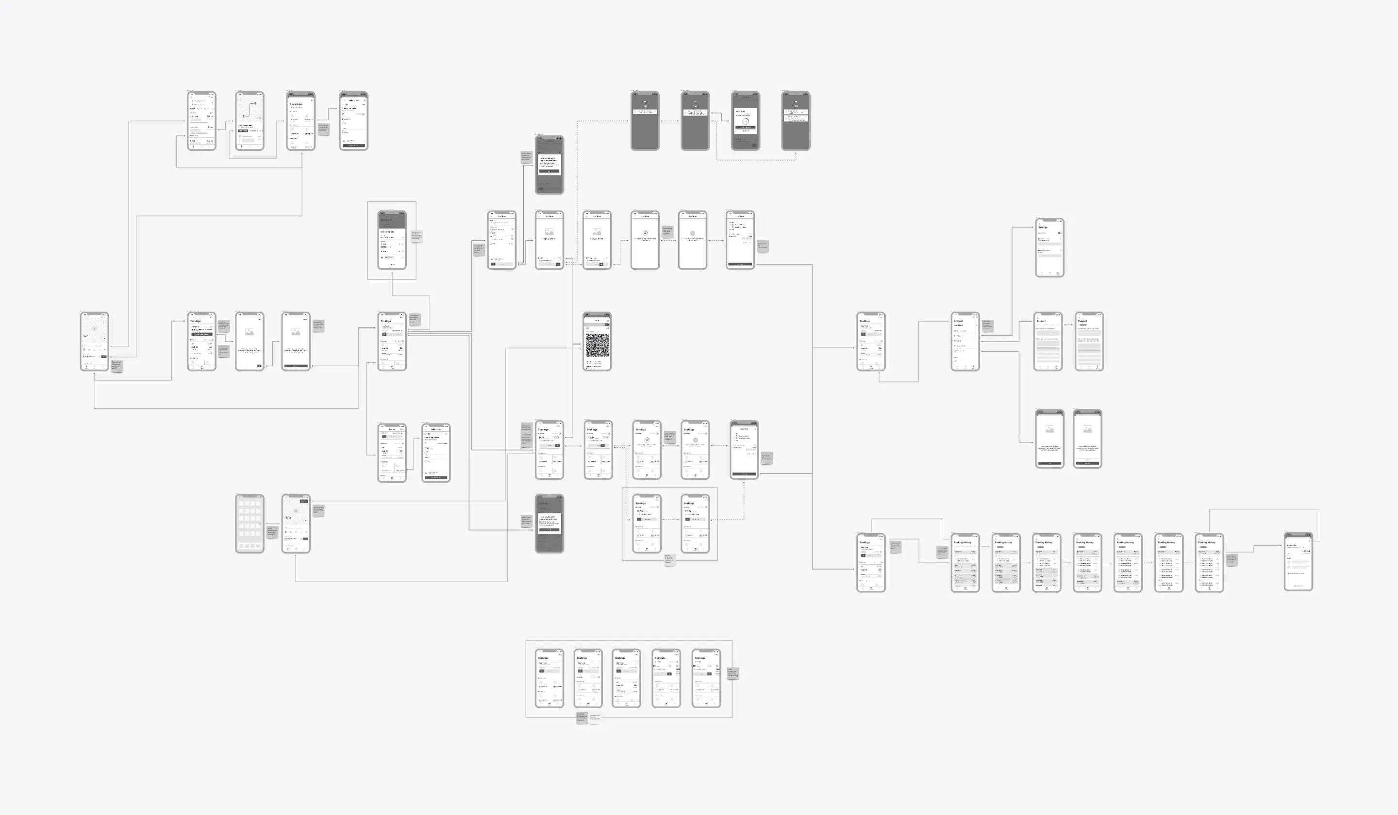
The situation
Complexity as an obstacle
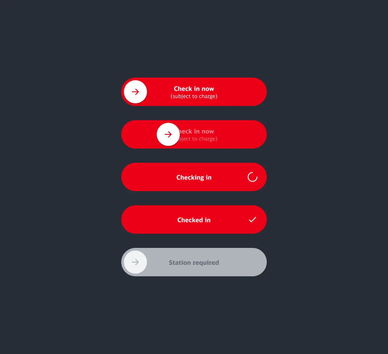
The German public transport landscape is challenging due to complicated fare systems and the existence of several associations, especially in larger metropolitan regions. This complexity makes it difficult for occasional travellers to get a clear overview of the available options. It can be daunting, especially when you don't know how the rest of your day will go. Will I still meet friends after work or pick up my kids from school? As part of our white label platform, we therefore introduced "Check in Be out" as a post-paid ticketing solution.
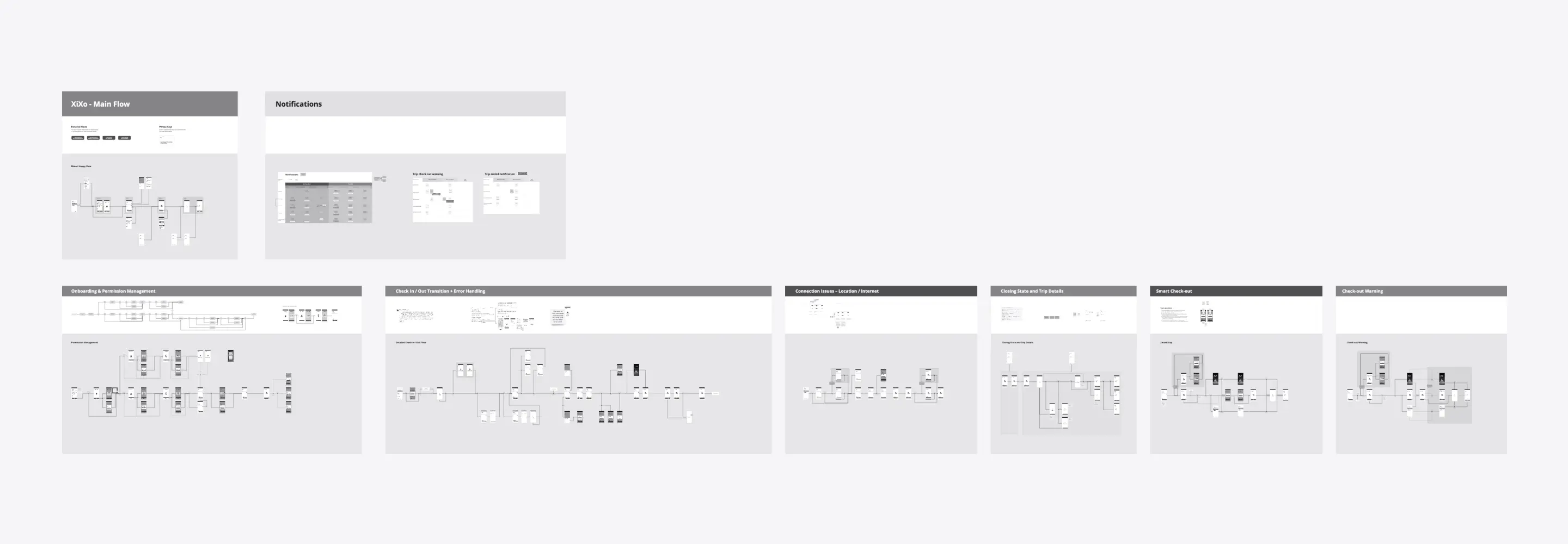
The challenge
About fear and requirements
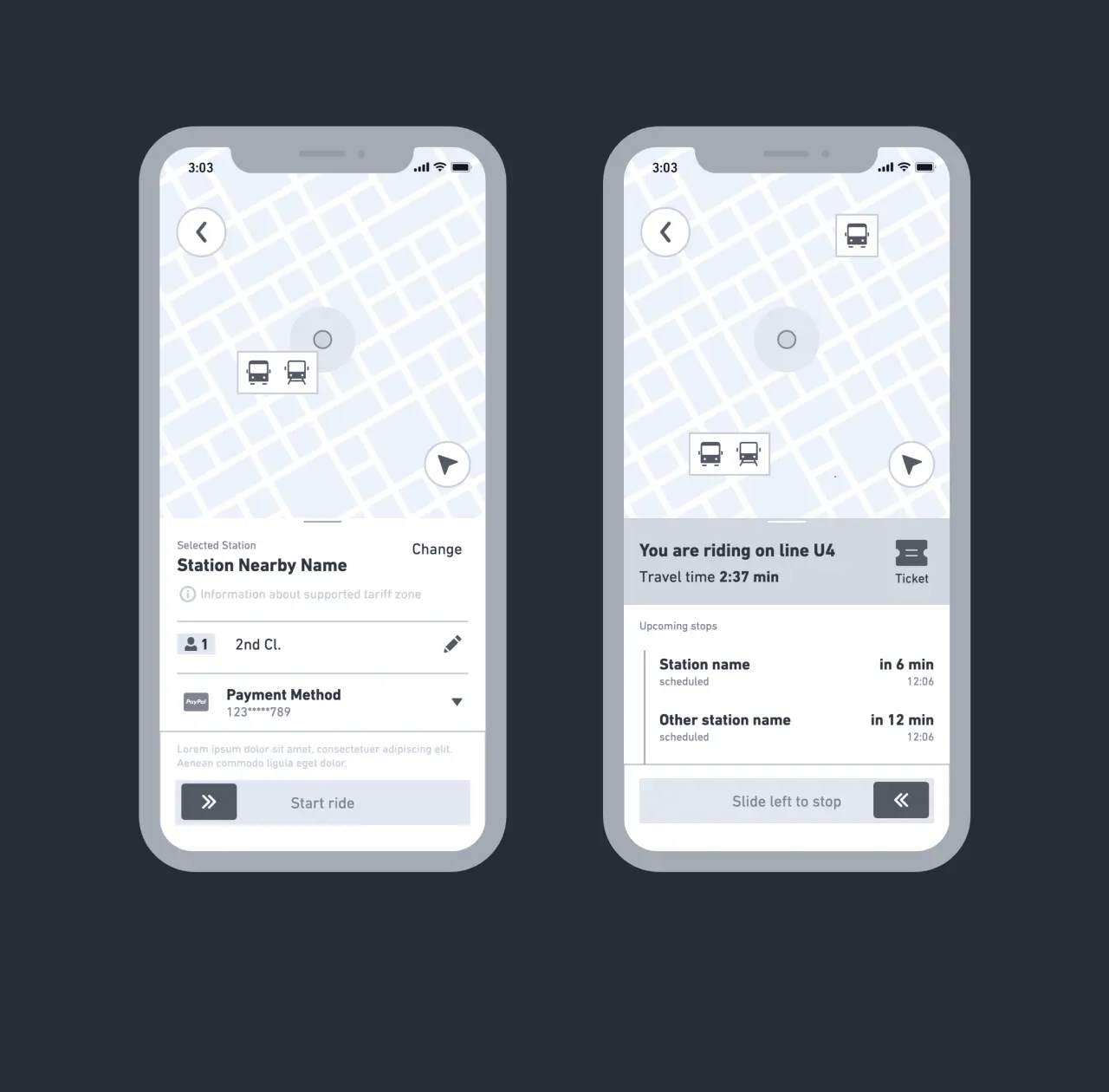
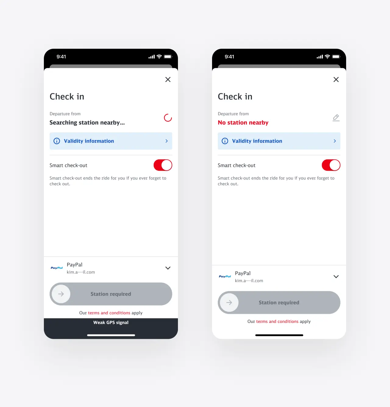
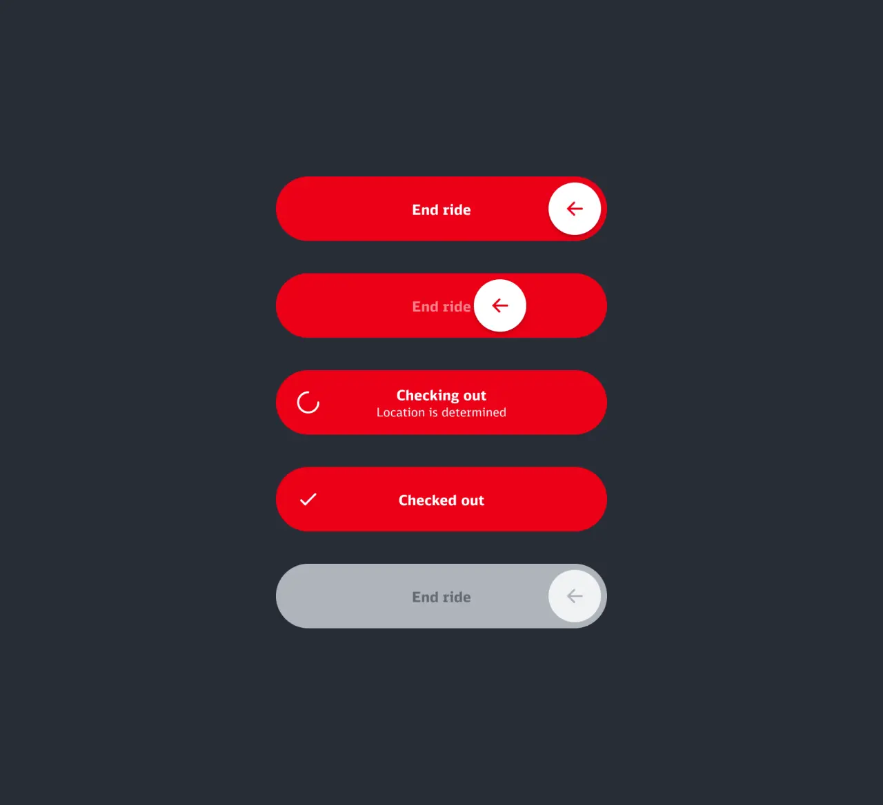
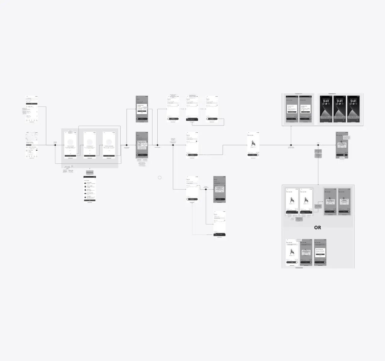
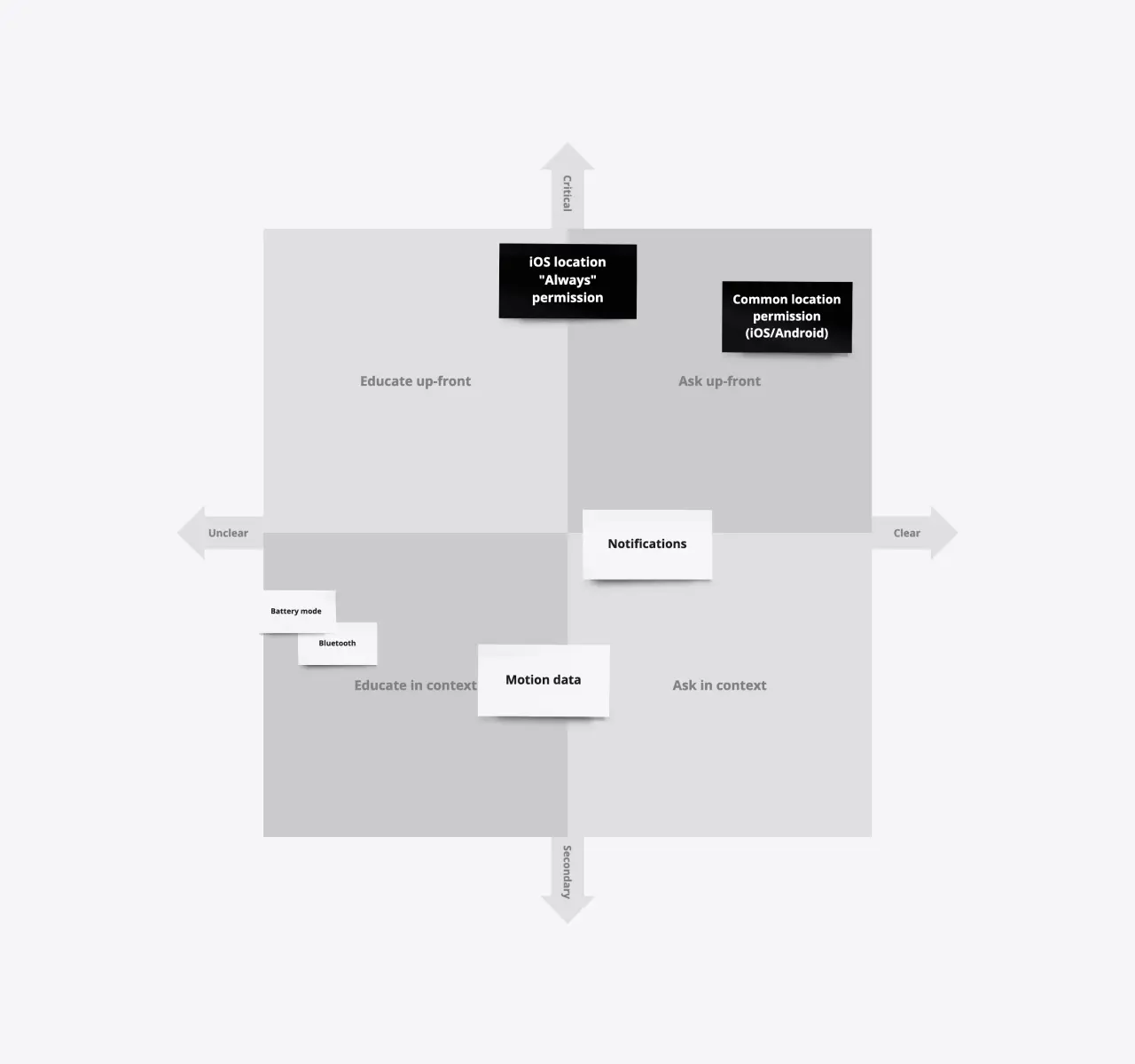
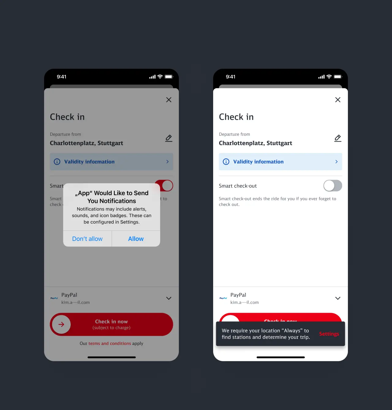
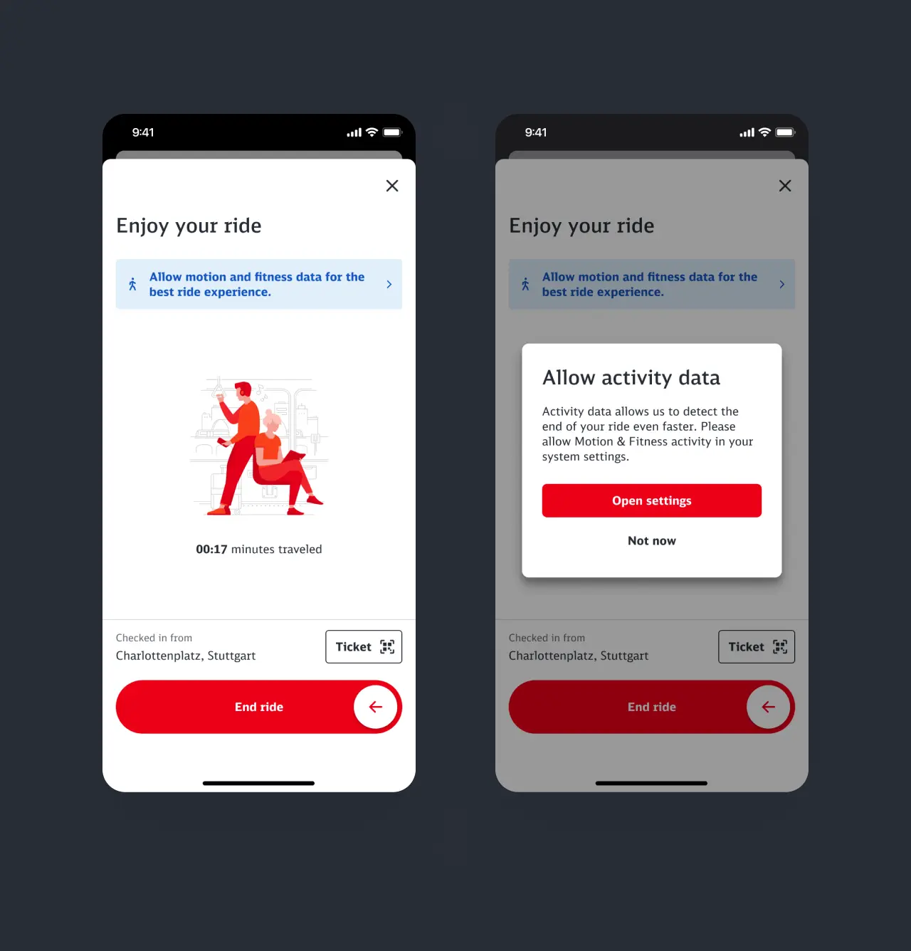
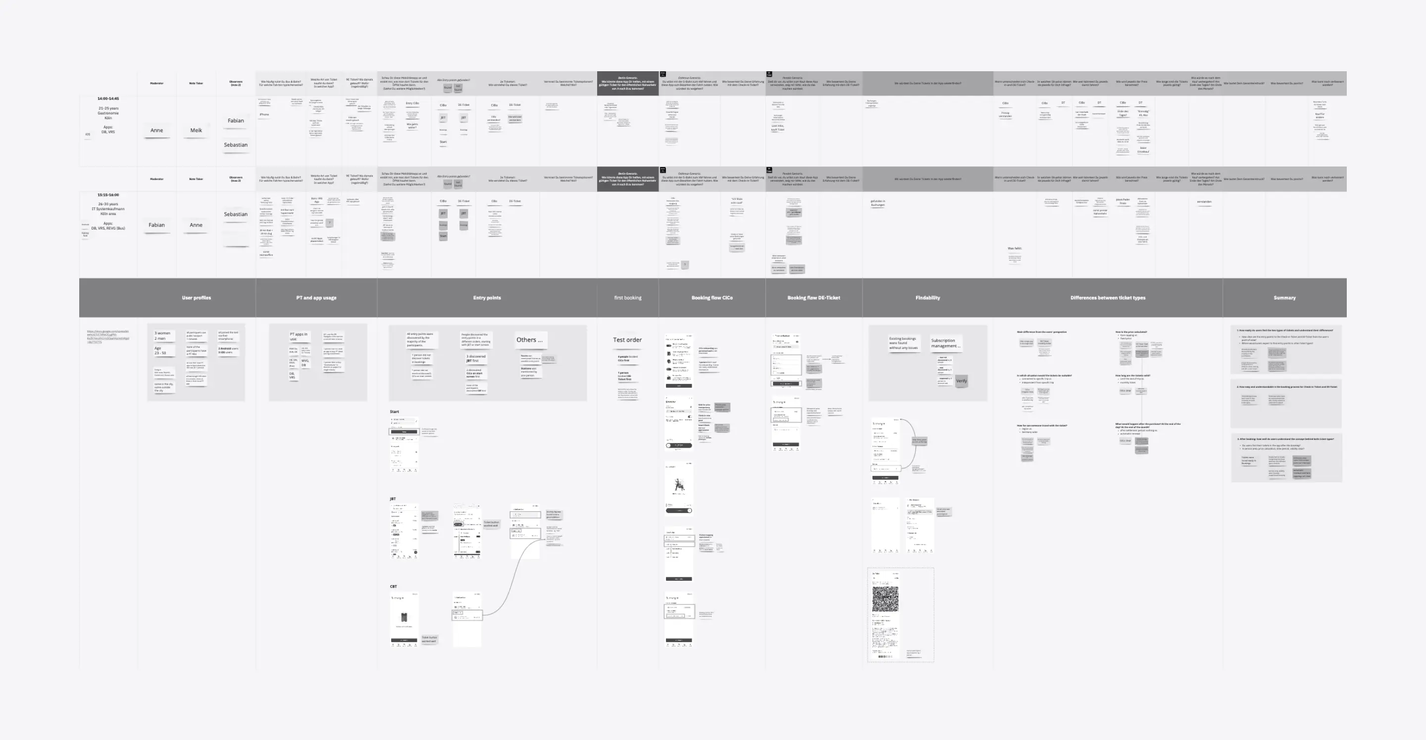
Post-paid ticketing offers many benefits but also comes with some obstacles to overcome. As a novel form of ticketing, the challenge was to find out what was the right level of explanation and introduction. As a system strongly coupled to the existing infrastructure, fallbacks had to be found for underground stations which made it challenging to determine the location of users. The most significant pain point, however, was the large number of permissions required to ensure the highest quality user experience. A series of user research sessions and iterations allowed us to evaluate which permissions would be granted willingly and how much education is needed.
The solution
Price capping as an incentive
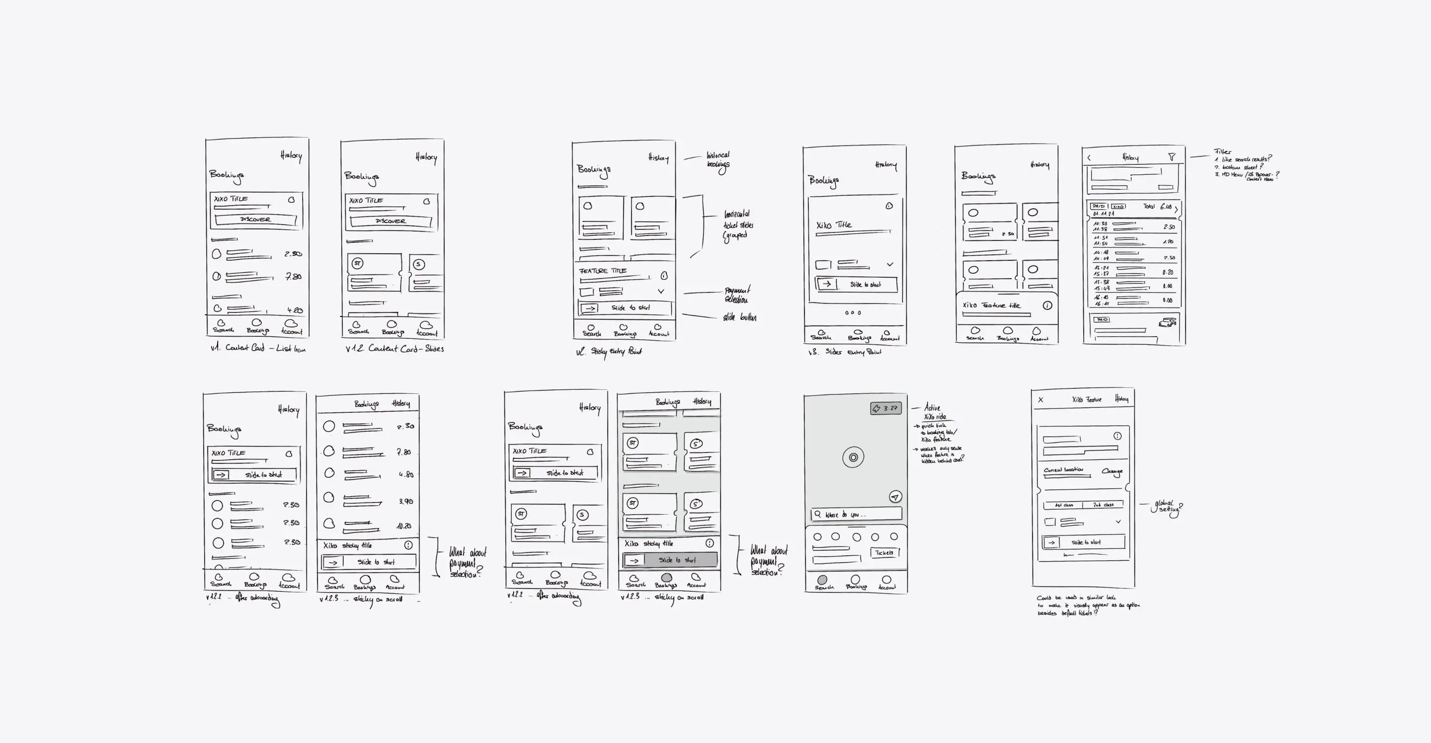
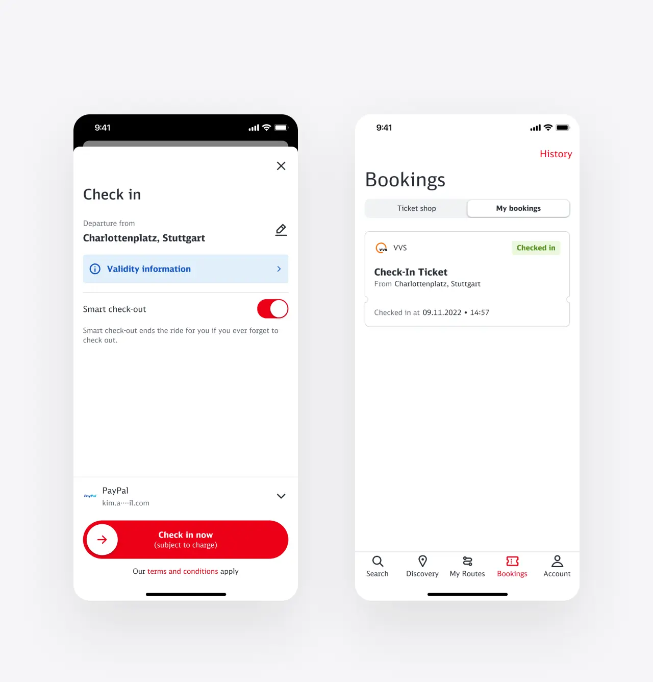
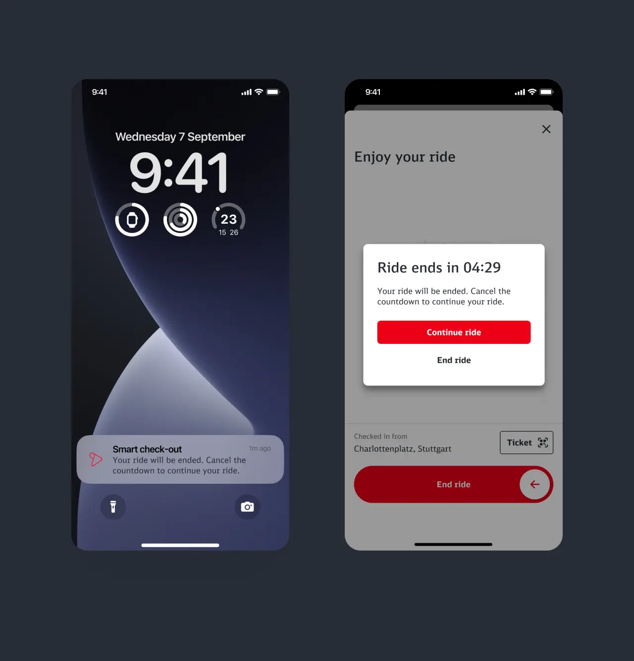
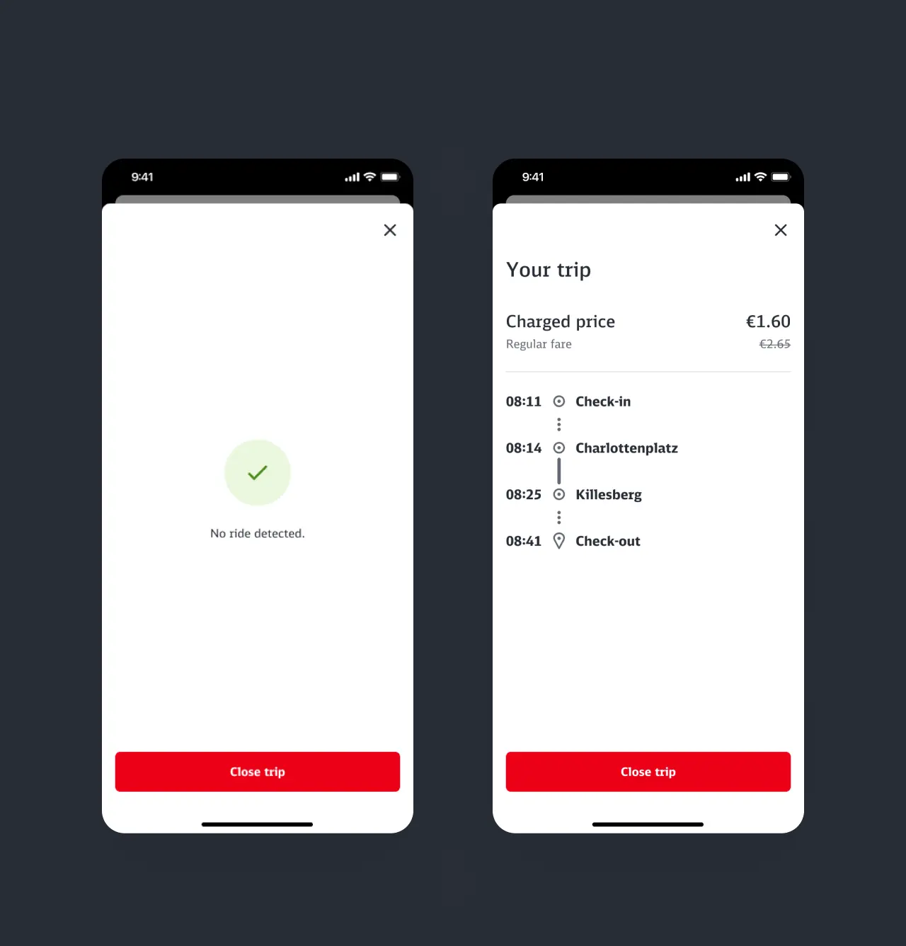
A respectable result. In a multi-stage process, we developed a feature in several releases that meets users needs. Education has been stripped down to the bare essentials to minimise the impact on the first launch experience. Based on our results, we developed the most contextual permission requests possible to provide the user with the appropriate experience based on their decisions. To top it all off, a global booking history was introduced that reveals the strongest benefit of the feature - price capping as an incentive. With several journeys per day, users always travel at the best price.
My contribution
From concept to completion
Being the UX/UI designer in my vertical and cross-functional team, I played an essential role at every stage of feature development. By leveraging my design skills, conducting user research, and collaborating with stakeholders, I contributed to the creation of a user-centric and visually appealing feature. The expertise I possess in UX writing, screen design, and design system integration proved invaluable in delivering a cohesive and engaging user experience. Through effective communication and collaboration with the talented team, I successfully fulfilled my responsibilities and achieved the project's objectives.
Next project
Beyond booking
Proceed
